Material-ui (ratings component)
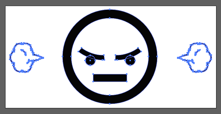
In my case I wanted the custom SVG below to fill well into the material-ui rating component structure

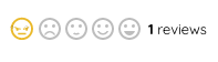
Visually this is how that structure should look like
my icon should get filled with the right colors. I should’nt have to write custom css to match whats already going on.
Material-ui writes in the style below on the root element where all icons live.

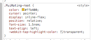
I noticed that all svg shapes inherited this style
All I have to do is add this property to mines. right? Wish it was that simple. It actually is but something on my part complicated things. I have strokes in my custom icon. So I had to go into illustrator and convert strokes to outlines
Heres another post where I explain how to accomplish this
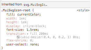
After converting all paths to outlines, I then added the css property below to my svgs shell
.AngryEmoji {
    fill: currentColor;
}